
Welcome to My World .˚𖦹⋆✮⋆.˚
Hello I am Emma Secchi and I am a creative based in Melbourne, Australia. I have a bachelor in Communication Design and this website is my dumping ground for everything I am so feel free to find your way around based on what you need from me ⋆˚☆˖°

Who the H*ll is Emma Secchi?? .˚𖦹⋆✮⋆.˚
Emma Secchi is a multidisciplinary graphic designer and 3D artist from Melbourne, Australia who recently completed a Bachelor of Communication Design at RMIT ⋆˚☆˖°I am a both a graphic designer and 3D artist and enjoy combining different mediums to create unique visual outcomes. As someone who judges a book by it's cover, I'd love to work within the publication field. However, I also enjoy poster design and would also love to work on a campaign one day. I honestly just want to try it all.Every design I touch is infused with my humour and personality; Design! Should! Be! Fun!Some other fun facts about me: I like to yap (good with people). I dropped out of law school (sees things from multiple perspectives). I am obsessed with my cat (understands boundaries and how to push them). I am really good at starting hobbies and not finishing them (well rounded and willing to give anything a go).
Selected works .˚𖦹⋆✮⋆.˚

Design in Human Form
2026 | Publication

Experience is the Force That Drives Human Nature
2026 | Zine

"I Am Here" Capstone
2025 | Zine & Mixed Media Animation

Georgia Typeface Specimen Book
2023 | Publication

Reclaimed Campaign (Concept)
2025 | Campaign
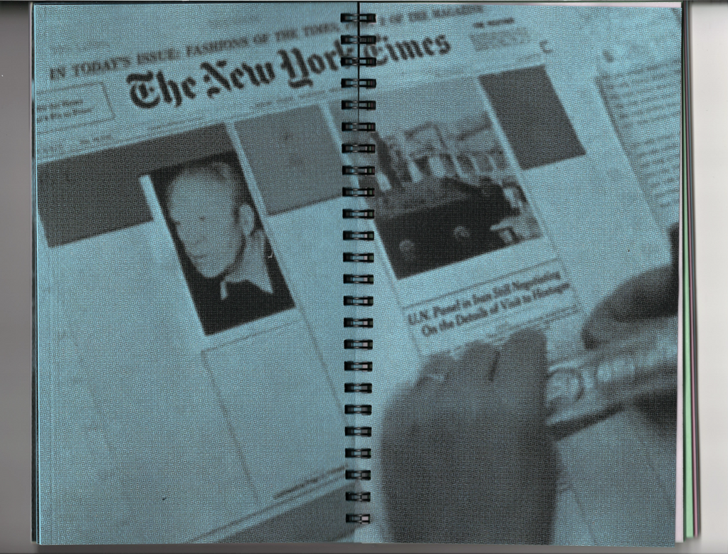
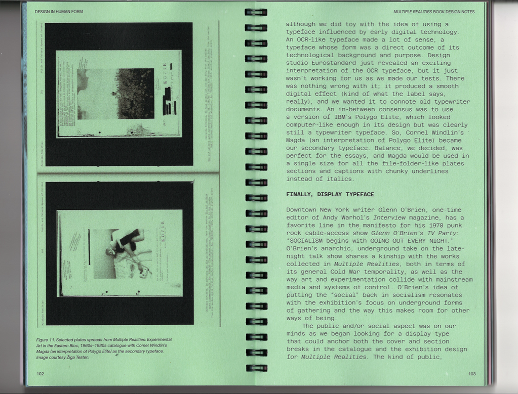
Design in Human Form .˚𖦹⋆✮⋆.˚
This 200 page publication contains texts which share a common theme; involving creative processes of being a designer and the evolving design technologies in which we use. Consequently, the title for this publication, Design in Human Form emphasises the human nature that innately exists within graphic design.Accessibility is important for this book, in which it should be easily digestible for the viewer, despite it being a large publication. Therefore, making an A5, slim, spiral bound publication encourages this through its portability when reading. Its small size aims to avoid reader fatigue by separating long text with visual dialogue and provides an intimate reading experience to the viewer. The use of spiral binding allows pages to be laid on a flat surface, or folded behind itself, allowing for ease for reading. Furthermore, the imagery is printed in black and white on coloured pages which reflects accessibility and affordability for designers in print production. To ensure the different themes of the text are emphasised, different coloured pages and typography styles have been used for each text. These variations between texts allow for different interpretations of the content by the reader, creating visual intrigue when reading through the extensive page count of the publication.


"I Am Here" Capstone .˚𖦹⋆✮⋆.˚
“I Am Here” is a reflective exhibition narrating my personal experiences of growing up and developing into the person I am today, through a series of zines and a mixed media animated introduction. Each zine is a reflection upon key points of my life from childhood, the challenging teenage years, to the outcome of adulthood. As a sentimental person, I often find myself looking back upon stages of my life, considering how each aspect has brought me to where I am today.Considering creativity has always remained a core part of my being, it was important to emphasise this through creating each zine with as many physical methods as possible, particularly in the rise of AI. The heart, soul and passion that comes through the creatively vulnerable process of creating a design is something that AI cannot ever replace.
"She lives within me"
The first zine apart of the “I Am Here” exhibition, detailing the curious, innocent and whimsical nature of childhood.
"Growing Pains"
The second part of the “I Am Here” exhibition, detailing the all-consuming emotions of teenage-hood.
"How Lucky Am I"
The final zine apart of the “I Am Here” exhibition, reflecting on past experiences and how they have paved the way for adulthood, allowing for growth and new experiences.
Experience is the Force That Drives Human Nature .˚𖦹⋆✮⋆.˚
This zine is a personal Acknowledgement of Country through the lens of human experience. The constraints were to use an A3 size sheet of paper, therefore resulting in an A6 zine. Imposed and printed by me. The imagery reflect both human emotion and environmental aspects of the Acknowledgement.


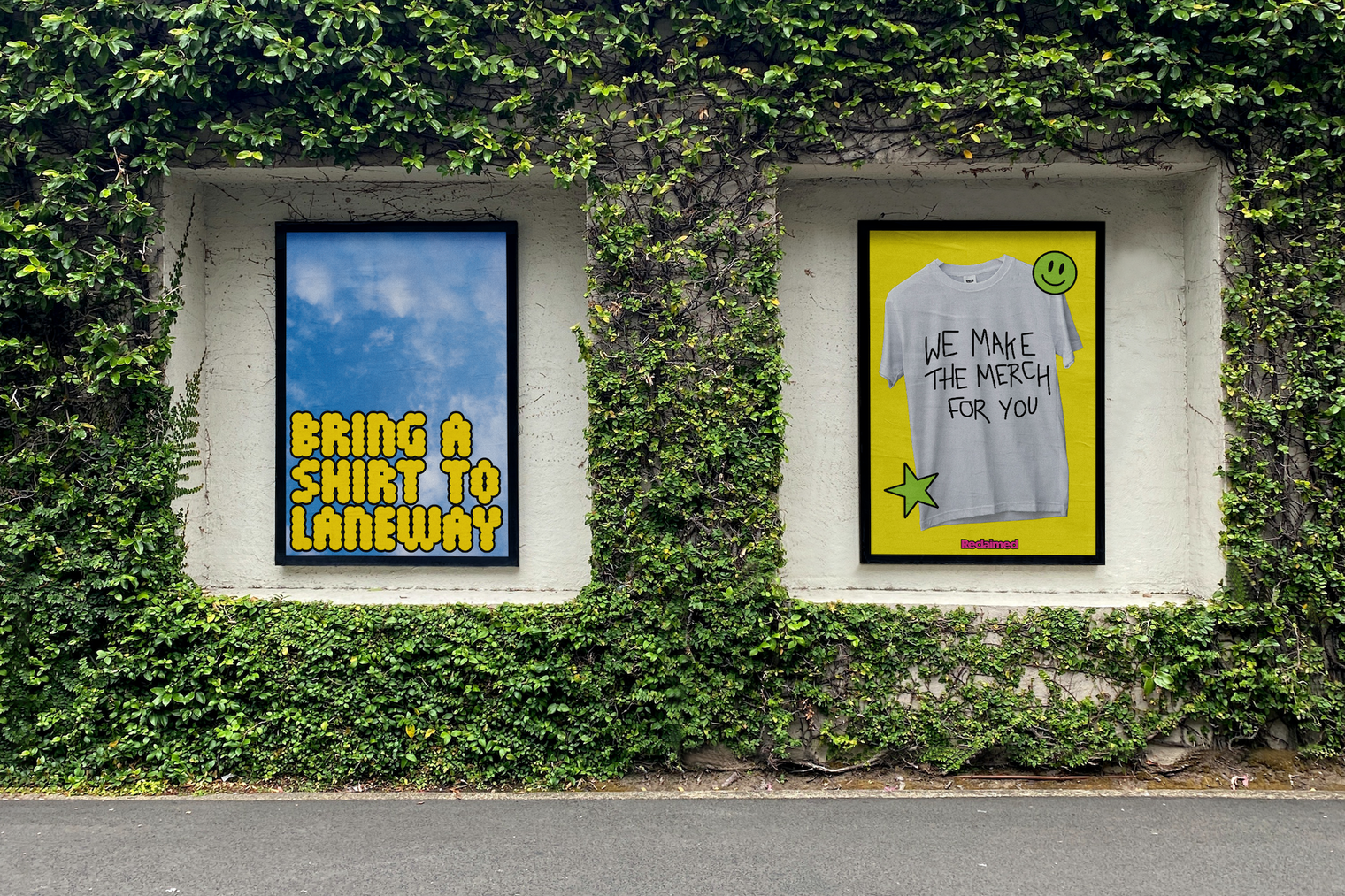
Reclaimed Campaign [Concept] .˚𖦹⋆✮⋆.˚
Australian Merch Co is a screen printing place located in Noble Park, Victoria and have collaborated with Laneway Music Festival, a popular music festival located in Australia which showcases a diverse range of artists. They will work together in the 2025 festival to create the merchandise for this event in a sustainable way, promoting underconsumption and supporting small businesses. Australian Merch Co has kindly lent Laneway their screenprinting materials to make this experience come to life.The goal is to encourage people to bring their own preloved clothing to this festival, in which they can be screen printed with Laneway Festival branding. We are trying to bridge the gap of overproducing merchandise by encouraging young Australian’s to reuse what they already have and create memorabilia to extend the longevity of clothing.
Event Booth Banner

Event Booth Instructions

Swing Tags


Posters

Promotional Video
Social Media Carousel

*Other Social Grid Concepts

Impact Report

T-Shirt Dropbox Concept
For those unable to bring a shirt to Laneway, drop boxes will be placed in public area’s for people to drop their old t-shirt’s they don’t wear. These will be washed, sorted and reused for the festival so people can still get merchandise, without producing extra waste.

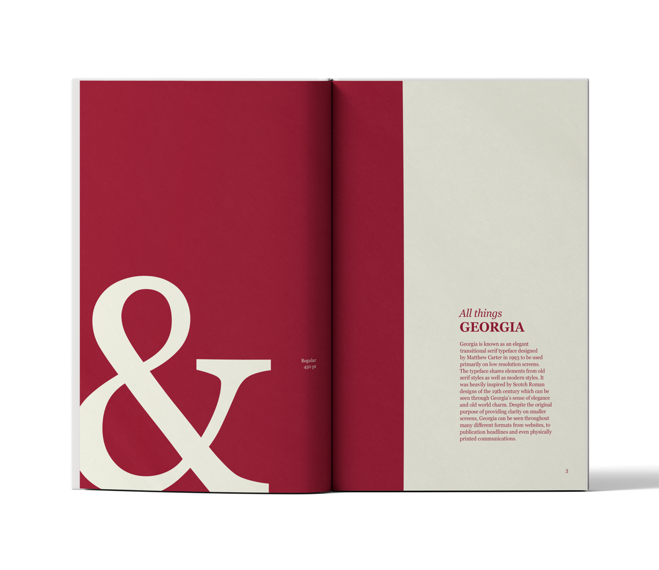
Georgia Typeface Specimen Book .˚𖦹⋆✮⋆.˚
The focus for this type specimen book was to show a ‘bigger picture’ of Georgia, demonstrating letters in use, outside of its initial purpose. I wanted this specimen book to be the size of a typical novel to still acknowledge and appreciate the original intention of Georgia’s use at a smaller size. However, for display pages, I used large lettering to highlight the details of the typeface that would typically be missed on a smaller scale. I ensured a simple colour palette was used to not detract from the details of Georgia and ensure uniformity and cohesiveness between pages.


Playground .˚𖦹⋆✮⋆.˚
↳ Graphic Design
J