THE CREATIVE RESET BRAND IDENTITY
GO BACKStudents were required to construct a complete brand identity based on their 'origin story' (mine was about my creative journey). Students were to use their brand identity guidelines to implementing their brand in a variety of spaces including digital and physical spaces.
The brand I created is called "The Creative Reset" which is essentially a safe space for artists who experience art block, creative anxiety, feeling behind in life etc in order to reignite their passion. It is originally a magazine featuring interviews and sources of inspiration which extends to creative community events and workshops as well. The brand targets creatives of all mediums and therefore had to be cautious about the language and imagery used in order to make it inclusive.
The overall values include being motivational, inspirational and nurturing but also doesn't take itself too seriously. The brand's tone is casual, relatable and punchy which can be seen through the headlines throughout various different formats. The creative direction aimed to be simple, yet artistic and playful which is evident through the unique imagery that catches a viewers eye, but particularly targets creatives.
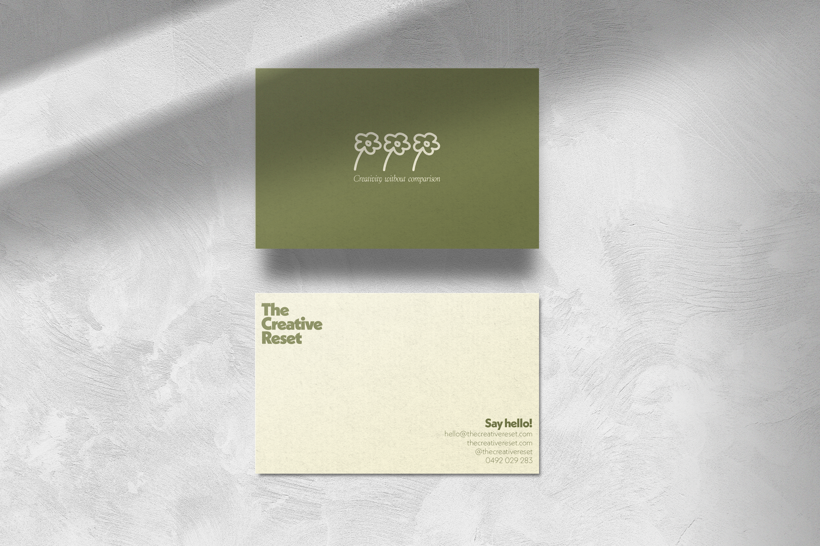
Business cards for The Creative Reset. Utilising the logo mark in the centre of the front of the card and the use of white space on the back of the card in order to maintain simplicity but provide a tone of friendliness through the flowers and typography.
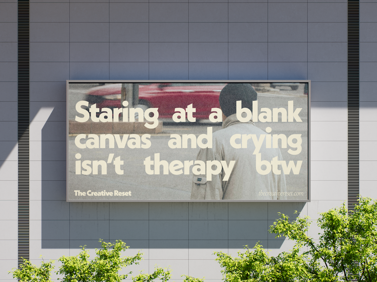
A billboard to be used within the streets of Melbourne CBD but also can be used on highways and freeways due to the simple writing.
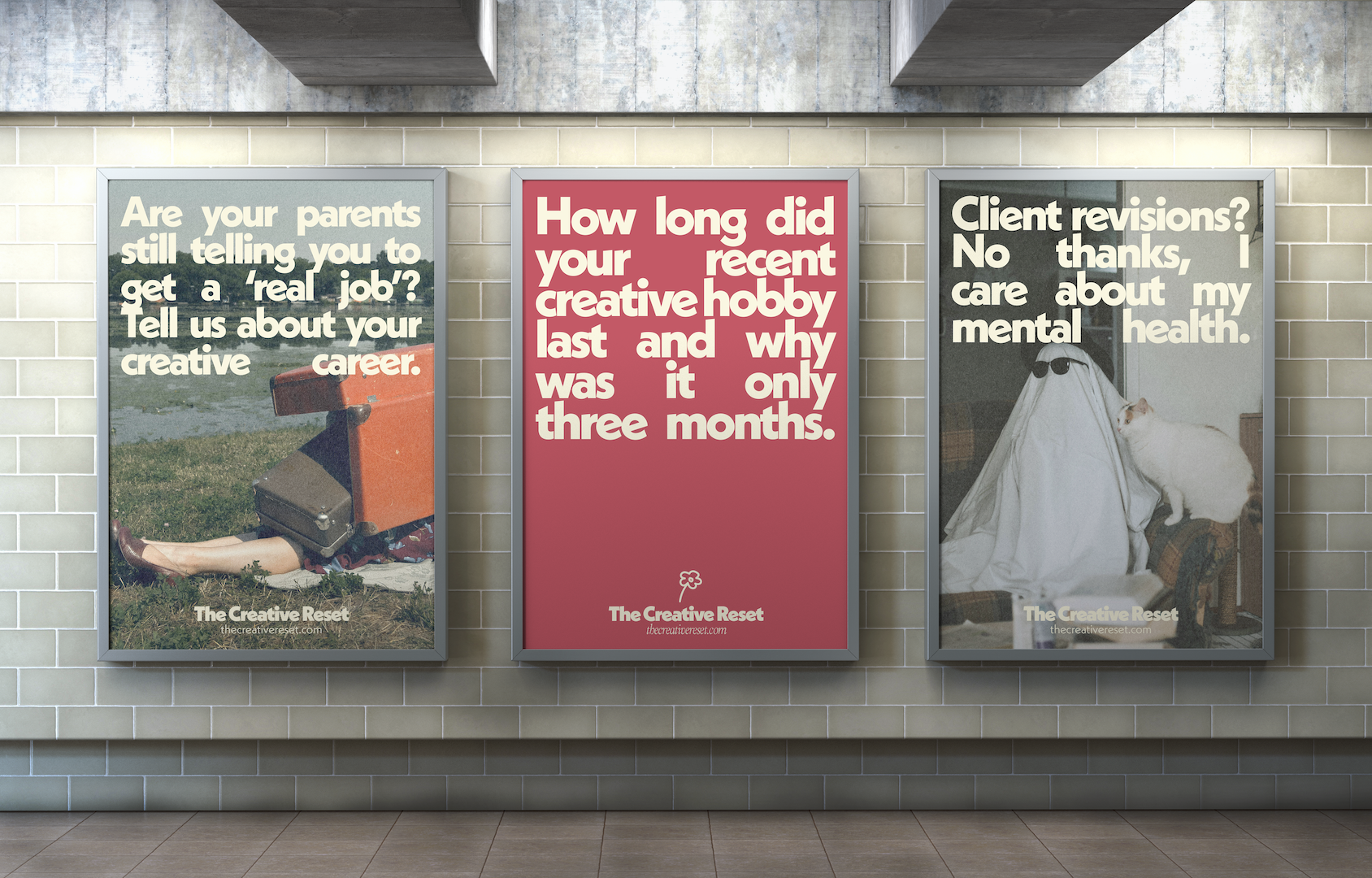
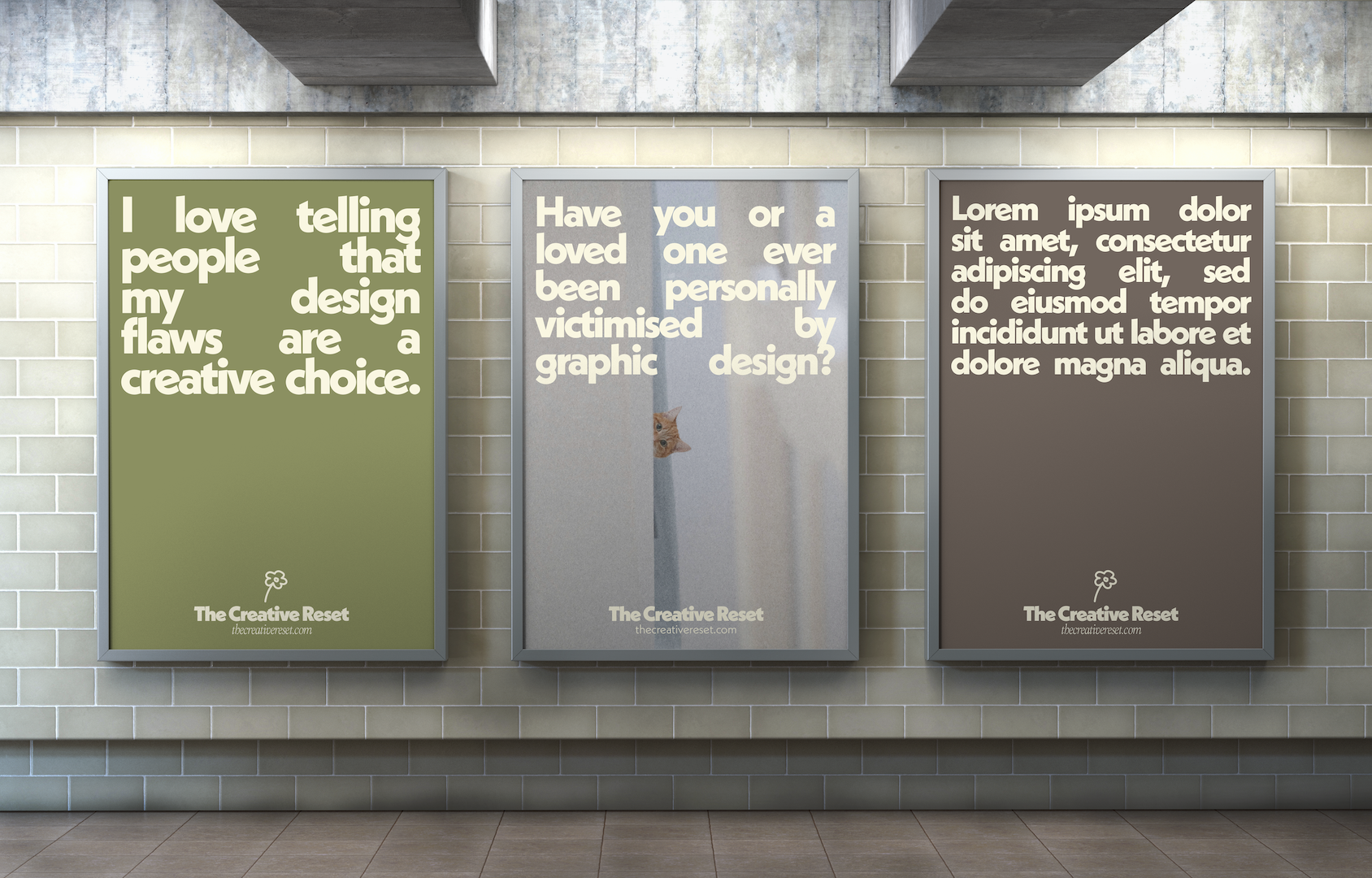
The style of street posters focuses on punchy witty lines to grab the attention of creatives. The posters should be specific enough in which it captures a creative's attention, but also broad enough to not exclude anyone from any specific niches.
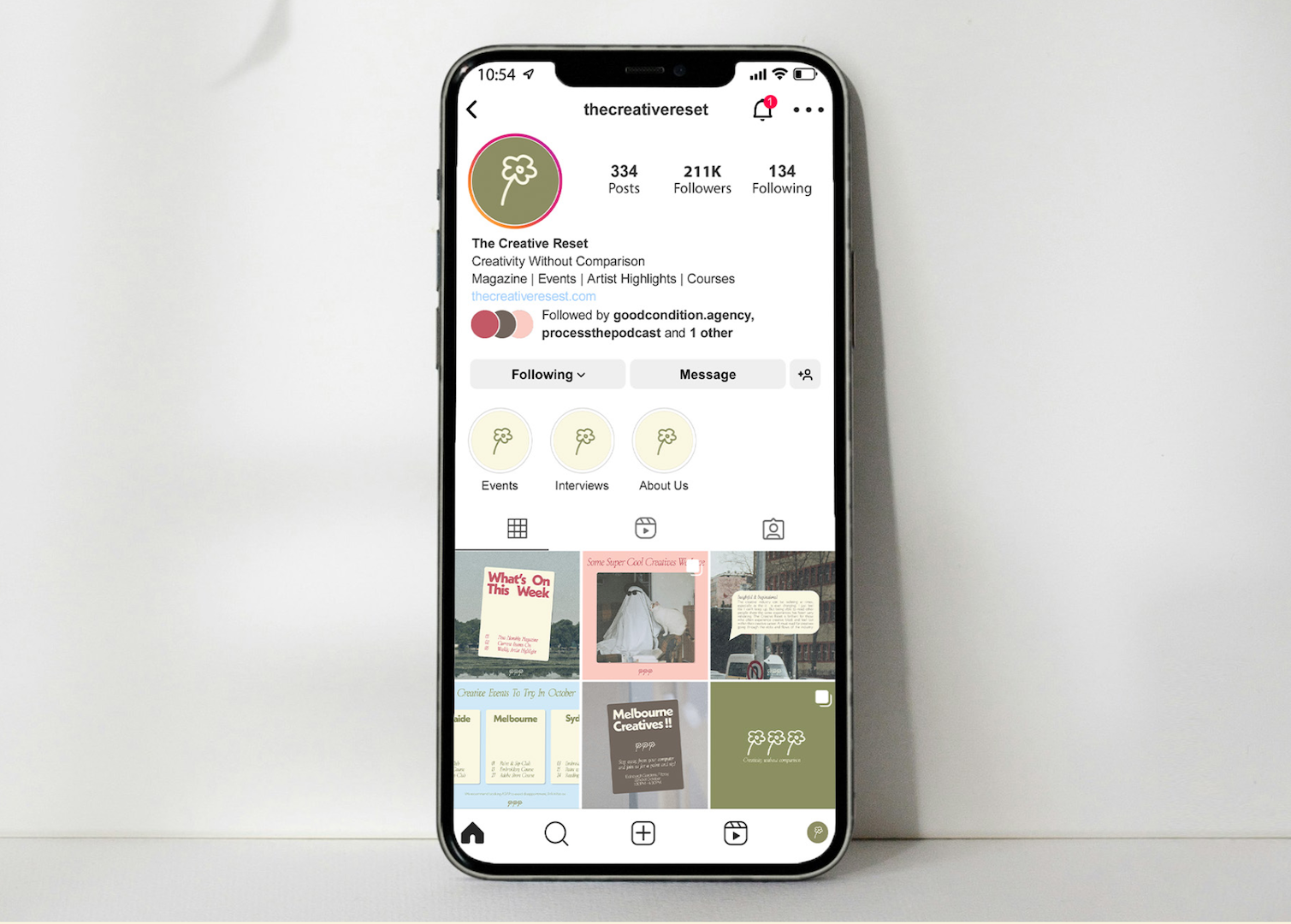
An example of the instagram page. The aim on the instagram page is to promote the different events The Creative Reset holds as well as sources of inspirations and any updates about the magazine releases and interviews. It utilises the imagery and the brand colour palette to create an eye catching page that is instantly recognisable for the brand
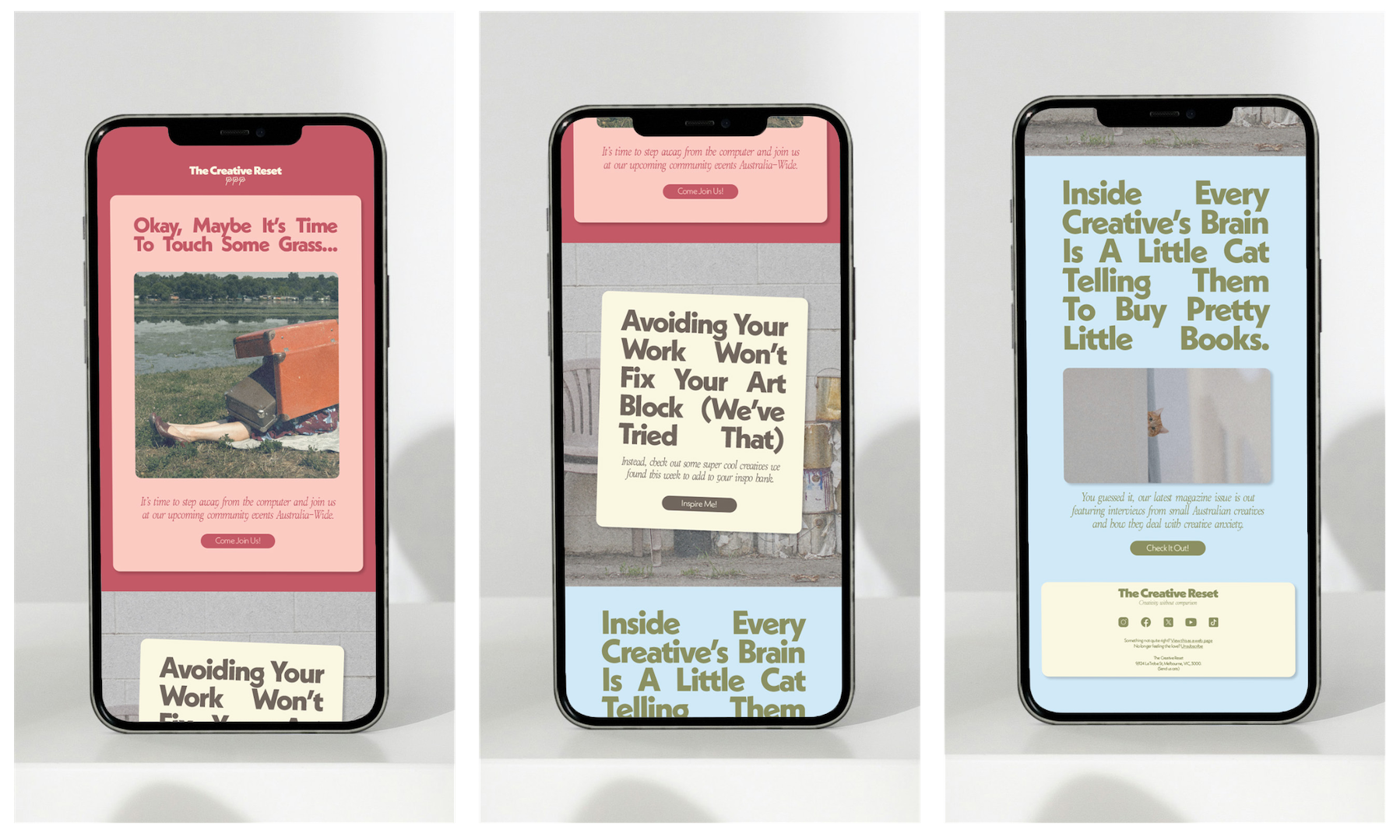
This is an example of the style of EDM that would be used. It focuses on short punchy headlines to capture the target audience of creatives amongst the sea of spam in their unread emails.
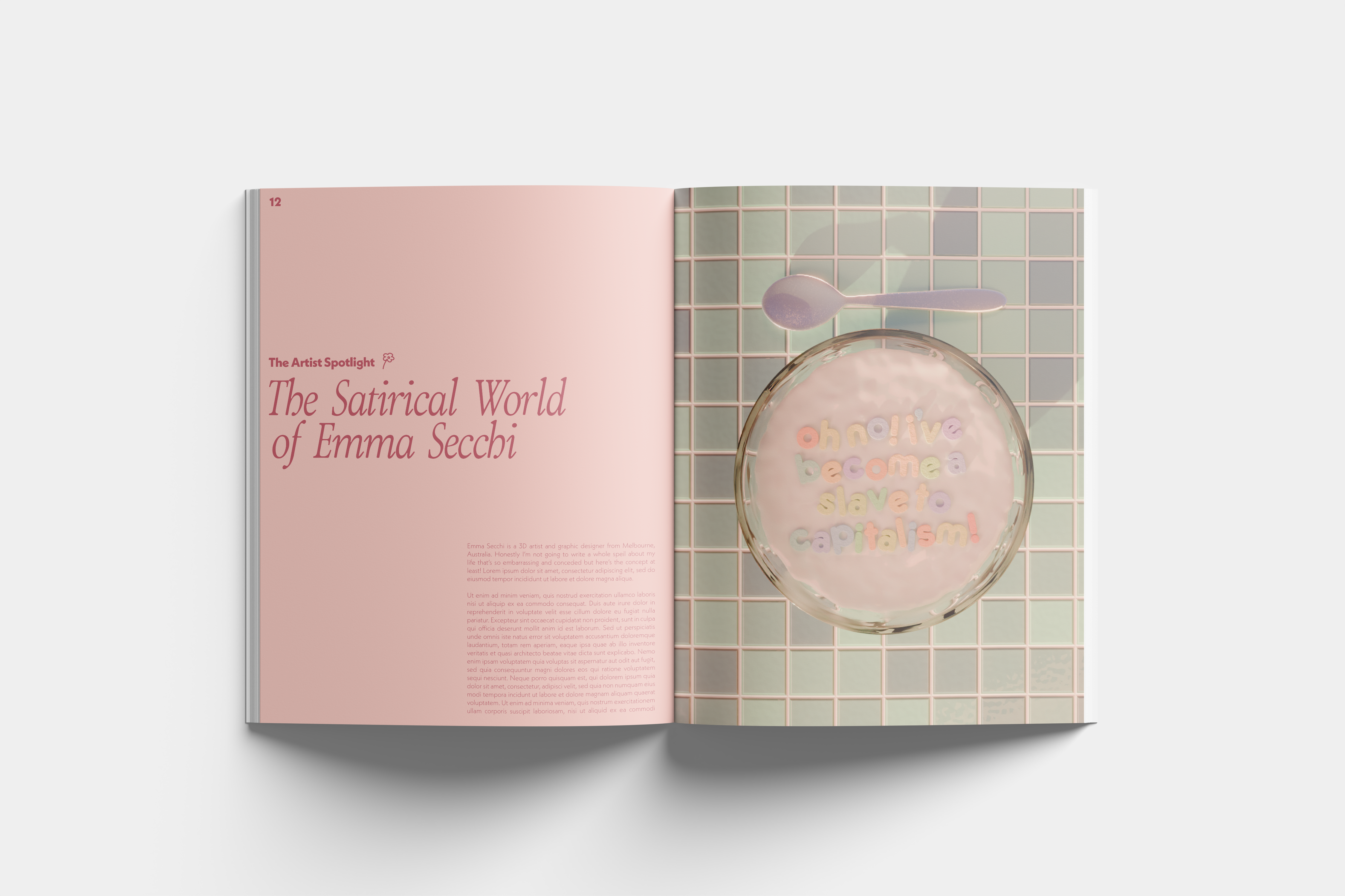
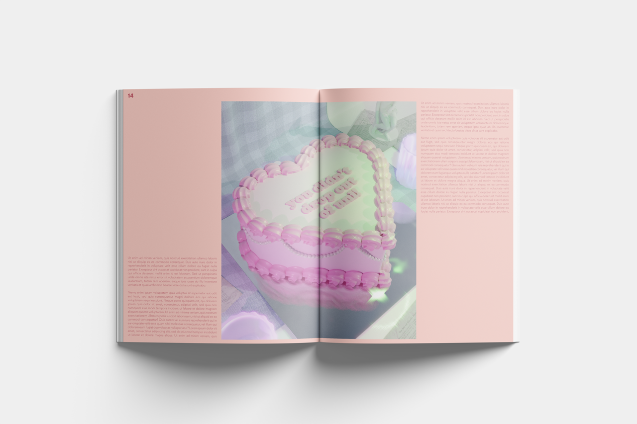
SHOWCASE PIECE
The assignment required a showcase product, in which I decided to create examples of the magazine that the brand would produce. It showcases an example of how it would exhibit different interviews and articles. It aims to be a balance between something that is digestable, but also act as a coffee table book and be used as a source of inspiration.