ORIGIN IDENTITY POSTER
GO BACKStudents were required to construct a brand identity including a logo, graphic marks and colour palette shown through two A3 posters based on something that has made them who they are today, thus their "origin identity".
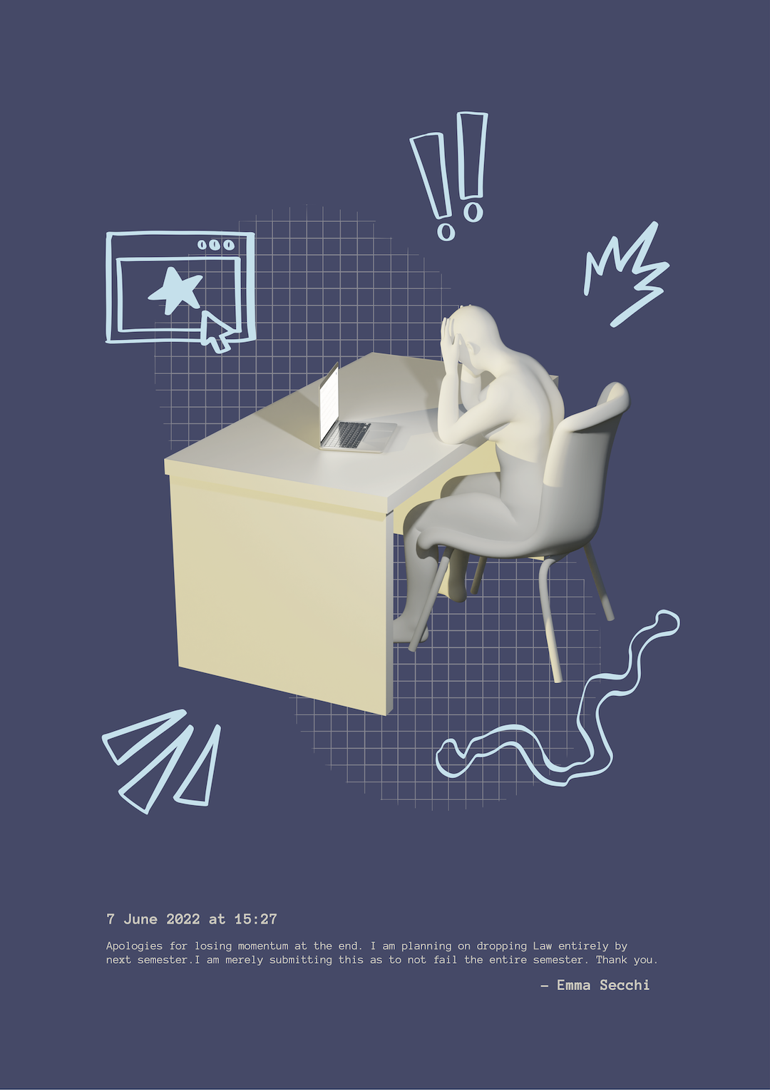
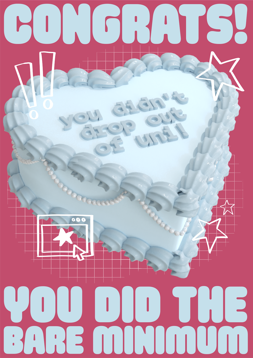
The posters explored my creative journey, particularly in regards to how I finally came about to studying graphic design after dropping out of three different courses prior. The aim was to incorporate 3D renders as that was what lead me to begin the course, as well as illustration elements to pay tribute to my previous art styles.
The top poster emphasises the dread and dispair I felt after dropping out of Law after a year and a half using Blender 3D for the centre graphic and vectorised procreate drawings for the graphic marks. The text is unfortunately a real message I had sent one of my law lecturers before I had dropped out of law. The dark blue colour palette aims to emphasise the emotional and empty state I was feeling at the time.
In contrast, the bottom poster is a satirical poster celebrating the achievement of completing one semester of this design course without dropping out. The cake is inspired by a previous creation I had made in Blender at this point of time in my life, however I had tweaked some details to suit the assignment. This poster is satirical to me as it feels like the "bare minimum" to not drop out of university, considering majority of my friends have moved onto their adult careers whilst I am repeating first year of university for the fourth time. The bold pink and blue colours add a playful tone contributing to the celebration and ironic nature.